Colour combinations – wood flooring contrast games
Matching dark wood floors with your house’s interior may look difficult, but there are many opportunities to make a beautiful contrast.
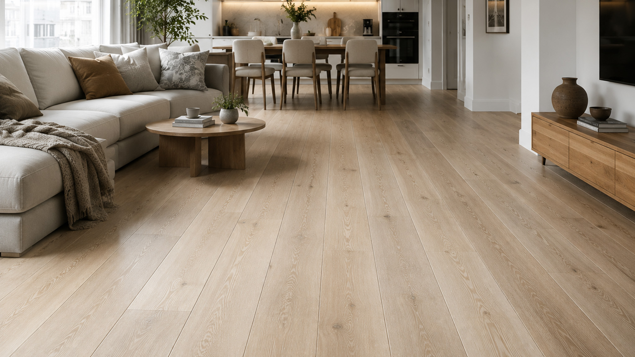
Matching a dark wood floor with the rest of your interior might look difficult at first glance, but there are plenty of opportunities to create a genuinely beautiful contrast.
Dark wooden floors have been one of the defining flooring trends of the past few years, and it's easy to see why — many people are drawn to the stylish, elegant, non-traditional look they bring to a room. They're fashionable, versatile, and can complement a wide range of interior styles. It's worth knowing upfront, though, that darker tones aren't well suited to smaller, narrower, or already-crowded spaces, where they can make a room feel more enclosed rather than more sophisticated. If you've already committed to a dark floor for your home or workplace, there are a few design fundamentals worth understanding first — the difference between a room that looks like it's been lifted from a design magazine and one that just looks a bit dim. Want to learn how to pull off a genuinely sophisticated, modern look? Read on.
The first rule: contrast
Let's start with the single most important principle when working with dark floors: contrast. It's the number-one rule most interior designers work by when planning a dark-floored room, and for good reason. Fill a room with dark walls, dark furniture, and a dark floor, and you lose the visual separation between objects entirely — everything blurs into one indistinct mass rather than reading as individual, considered pieces. Ironically, a poorly balanced all-dark scheme often ends up feeling flat and washed-out rather than dramatic, precisely because there's nothing for the eye to land on. Get the balance wrong the other way, and a room can end up feeling cold and uninviting instead of cosy. Choosing this style is genuinely a bit of a design risk — if you don't manage to build in enough contrast, the room simply won't have the bright, comfortable feel you're after.
A quick, practical way to think about this: paint and fabric suppliers rate colours by Light Reflectance Value (LRV), a scale from 0 (absolute black) to 100 (pure white) that tells you roughly how much light a colour bounces back into a room. A dark floor typically sits somewhere around LRV 5–15. Pairing it with walls or key furniture in the LRV 60+ range — milky whites, light greys, pale beiges — creates strong, reliable contrast almost automatically, without needing to rely on guesswork or trial and error with paint swatches.
Here are a few practical tips to help pull the whole scheme together:
Start with the overall colour scheme, not just the floor. Before picking wall colours in isolation, sketch out roughly how the whole room's palette will work together — floor, walls, large furniture, and accents as one connected plan rather than four separate decisions. This gives you a clear sense of how the finished room will actually feel before you commit to paint or upholstery.
Focus on the walls and the large furniture pieces first. These are what your eye registers before anything else in a room, so they carry the most weight in setting the contrast. The simplest way to achieve a classic, elegant look is pairing a dark floor with warm brown, milky white, or light grey — a combination that reads as stylish in almost any setting and is genuinely difficult to get wrong.
Don't skip the details. Cushions, throws, artwork, and smaller decorative pieces are what finish the vision and give a room genuine depth and personality rather than feeling like a showroom display. Take your time with this stage — it's where a scheme goes from "correct" to actually feeling like a home, even if you're not confident in your own design instincts.
With the fundamentals covered, let's look at some specific colour combinations that work particularly well against a dark wood floor.
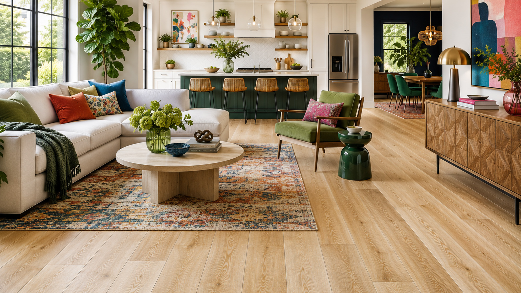
Warm and traditional: coffee, caramel, and beige
If your taste runs more traditional, pairing a dark floor with warmer brown tones — coffee, caramel, even a warm-toned beige — gives a room a deep, genuinely homey atmosphere. This combination works because it keeps the whole palette within the same warm colour family rather than introducing contrast through temperature, so the effect is cohesive and calming rather than dramatic. It's a reliable, low-risk choice for living rooms and studies where the goal is comfort over drama.
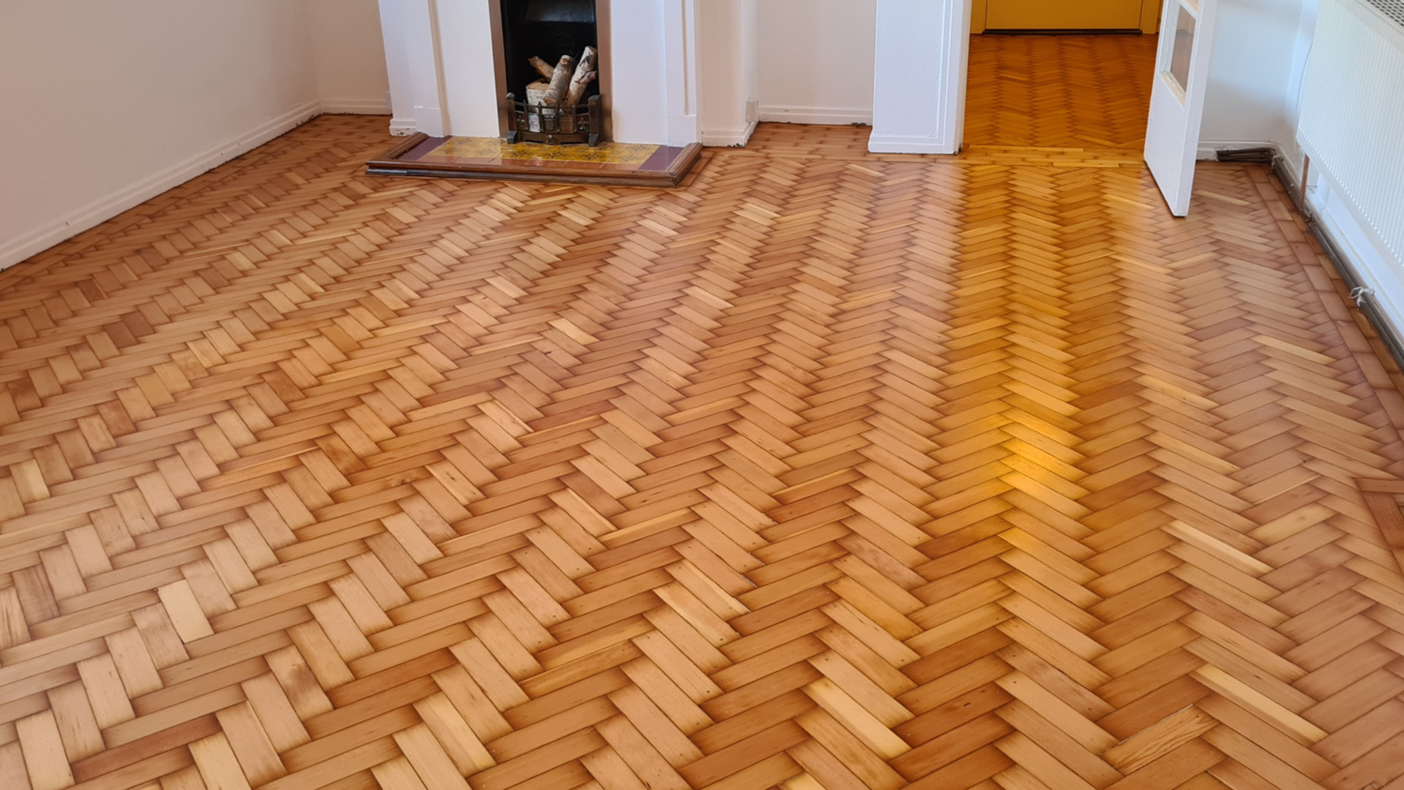
Classic and bold: black and white
Black and white is about as classic a pairing as interior design has to offer, and it's found its way back into fashion repeatedly over the past few years for good reason. Used carelessly, though, it can tip into feeling stark or a little cold. The fix is simple: introduce a few soft, milky beige or warm cream elements — a rug, a throw, upholstered seating — to take the edge off the monochrome scheme and bring genuine warmth back into the room without abandoning the black-and-white concept entirely.
Geometric and metallic accents
Geometric shapes and patterns bring real energy and visual movement into a space. Simple, symmetrical designs paired with white furniture create a distinctive, contemporary look, while a more traditional monochrome pattern gives a calmer, more classic feel. Either way, metallic accents — brushed brass, matte black, or chrome fixtures and hardware — add a genuinely current, polished finish and pair particularly well against a dark wood base, since the reflective surface catches light in a way flat colour alone can't.
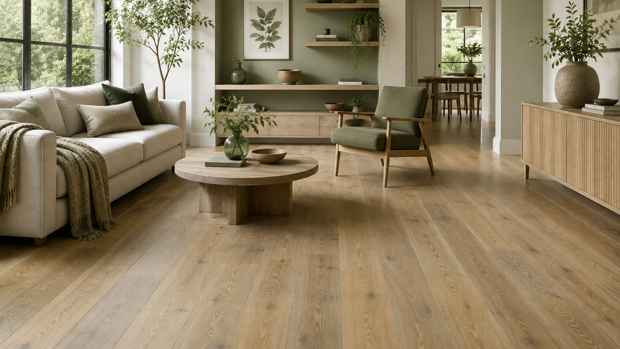
Bold and eccentric: yellow, orange, and red
Stepping further outside the usual comfort zone, dark wood floors can carry surprisingly bold colour schemes well — yellow, orange, and even red. Red works especially well in larger, more open-plan spaces (it's a colour that visually advances toward the eye, which can make a big room feel more intimate, but will make an already-small room feel noticeably tighter), and the pairing reads as thoroughly modern and a little eccentric. Orange is the more traditional of the three, bringing genuine warmth and a homey feel without red's intensity. Yellow works well as an accent rather than a dominant tone — a "pick-me-up" colour, often used in cushions, artwork, or a single feature wall, that lifts the whole room's mood instantly.
Luxurious: gold, bronze, and purple
For a genuinely luxurious feel, gold and bronze accents pair beautifully against a dark wood floor — think metallic light fittings, picture frames, or textured cushions. It's a particularly strong choice for a bedroom, where it lends a sense of prestige and quiet indulgence without tipping into showy. For a more mysterious, atmospheric effect, deep purple tones work well alongside dark wood too, and again suit a bedroom especially well — purple has long been associated with calm, restfulness, and a touch of drama, which makes it a natural fit for a space built around relaxation.
Fresh and natural: green
Lime, olive, sage, and deep forest green are all fashionable, contemporary pairings against a dark floor. Adding a few small, bright yellow accents lifts the overall scheme and stops a heavily green palette from feeling too muted. Green itself brings a genuine sense of freshness and natural calm to a space — it's a popular choice for kitchens in particular, though it's worth knowing that green tones are well documented to have an appetite-stimulating effect, so it's a deliberately good match for a dining or kitchen setting, less so for a room where you're trying to unwind after a big meal.
Calm and relaxed: turquoise, aqua, and light blue
For something a little different, turquoise, aqua, and light blue all sit surprisingly well against dark wood, particularly in relaxed, laid-back spaces like a lounge or living room. Blue tones are consistently associated with calm and lower stress in interior design research, which makes this pairing a strong choice for the rooms in your home where the goal is genuinely winding down rather than making a statement.
A practical note on living with a dark floor
Whichever palette you choose, it's worth knowing a few practical realities of dark wood flooring before committing. Darker floors show dust, pet hair, and light scuff marks considerably more readily than a mid-tone or lighter floor, simply because there's less surrounding colour to camouflage them — a more frequent, lighter cleaning routine tends to keep a dark floor looking its best rather than letting dust build up between deeper cleans. Dark floors also show water spots and streaking from mopping more visibly, so a well-wrung mop and a wood-safe cleaner matter more here than on a paler floor. None of this should put you off — it's simply part of the trade-off for the depth and drama a dark floor brings to a room, and one that's easily managed with a slightly more regular cleaning habit.


